

When visitors come to a website for the first time, they are only willing to invest a few seconds to find out what the website is offering about and whether they are interested or not in knowing more.
In MOOCs, the first impression students receive from a course would probably be as crucial, and a great part of this first impression will be based on the homepage and the navigation menu, which normally serves as an overview of the course.
The main menu structure will provide students with information about the conceptual mental model behind the course, the different parts or components and the course organization or structure.
Here are some examples of navigation menus from Coursera MOOCs, and some thoughts about them:

Navigation menus from 4 Coursera courses (left to right): Human Computer Interaction, Microeconomics principles, Gamification and Grow to greatness II.
- One list VS several subgroups of sections
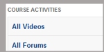
The early courses in Coursera tend to have a menu with a list of sections, one after another, without any subgroups or subsections.
This plain menu works fine for courses with a limited number of sections, but as the number of section increases, it is more inconvenient for users to have a bunch of menu options without any hierarchy. That is because, with this menu format, in order to figure out where they could find the information they need in every situation, users need to invest a certain amount time to read all the section labels.
Dividing the navigation menu into meaningful groups of sections, works more efficiently since it give the users the possibility to check only the name of the group sections, then decide which ones might include the information they need and skip the non-related group sections without having to read all the section labels.
- Descriptive an unambiguous labels
To provide an efficient navigation menu, menu labels should be unambiguous and descriptive enough to provide an accurate idea of the information and contents that will be found in this section.
Users should not be wondering what is the difference between two categories or in which section will they find the answer they are looking for.
For example: the “Peer grading” label does not clearly state if the section contains instructions to do the peer evaluations or the peer work that you need to evaluate? This ambiguity could have been solved using a more descriptive label “Peer grading instructions” or placing this section inside a navigation group “Course instructions”.
When deciding section labels, it could be advisable to use “trigger words” that users will look for to achieve their goals. The tricky part will be to find out what are the MOOC students goals and find out what would be the most common trigger words for them.
- Indicate external links
Users need to be able to predict which sections will open in a new window because its contents are placed outside the course website. Coursera correctly displays a small icon to mark those sections that link to external pages.
- Follow standards and conventions
If a platform has a set of standards or conventions, it is advisable to follow them since users will probably be familiar with them. When we break a convention we are forcing our users to stop, forget what they knew and learn how this element of the interface works now.
It does not mean that we are not allow to ever break any convention, but since it normally represents a burden for the user, it only makes sense if the benefit for the user overcomes the confusion and the extra learning effort.
- Organization based on: Lessons/weeks or Content type?
The general advice will be to organize the different sections and subsections based on clear and meaningful criteria for the students and define a consistent site structure or conceptual model where every item has a specific place.
Whether this conceptual model should organize the course materials by “Weeks/ lessons” or “Content type” is a complex issue. In traditional online courses the most effective navigation schemes were proved to be the ones based on lessons or weeks, since they allows students to easily find all information materials for the current lesson within the same place.
When translating this conceptual model from online courses to MOOCs, we are assuming that MOOC students have the same motivation and goals of students of traditional online courses (complete all activities for each lesson and pass the course) which could not be the case. A menu structure based on lessons or weeks could be uncomfortable or inappropriate for students who only want to consume some contents but are not interested in following the whole course and get a statement of accomplishment.
Then, how we combine the needs of different users? This a good question. My advice would be “ try to design a navigation structure that works best for your main/most important type of users but that also works reasonably well for the rest of your types of users.
Besides, you also need to consider standards and conventions: almost all Coursera courses have their materials organized by content type ( videolectures, quizzes,…), and therefore students taking more than one course, will probably expect and celebrate the same organization criteria in all their courses.
SOME IDEAS TO DESIGN A CLEAR AND CONSISTENT NAVIGATION MENU
Based on the previous considerations, my suggestion will be to combine alternative navigations aimed at different goals and consumption needs (the main menu is based on content type but the homepage includes a widget that provides an alternative navigation by lessons/weeks).
Additionally, if we could design a menu setup flexible enough to work for any course, it could really help students getting onboard every time they start a new course. Here is my attemp for this common menu setup that could be applied to any Coursera MOOC: 4 high level groups of sections based on clearly different goals (overview, get info, do coursework, interact and collaborate) and each of them would include different number of sections inside depending on the course needs and characteristics:
- Home: A single page displaying key information for the current week, the option to review past weeks, notifications for new announcements, student learning progress, deadlines…(You can see a proposed wireframe for this page in a previous post “The importance of overview and feedback“)
- Course Instructions: all information about the course, announcements, policies, instructions, how to pass the course…)
- Course Materials: all instructional materials and activities prepared or collected by the course instructor and staff: videolectures, readings, quizzes, exams, written assignments…
- Course Community: all virtual spaces where students can interact and collaborate with each other: discussion forums, wiki, social media links, a crowdsourced database of resources, showcased projects, help with subtitles…
Based on these considerations, I have made the exercise to reformulate the 4 navigation menus we sae at the beginning of this post, to assess if they would fit the proposed setup and if the result would represent an improvement or not.
So, what do you think about this common navigation setup? Any ideas, comments or suggestions to refine it?

Navigation menus from 4 coursera courses, modified to meet the common navigation setup proposed
Ps. You would probably have noticed that I have added a section called “Know your classmates” in the course community part, I will explain more about this in future posts.
